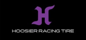
Hoosier Racing Tire Reveals New Branding, Logo
 Hoosier Racing Tire has revealed a new logo and branding, the company announced.
Founded in 1957 in South Bend, Indiana, the purple color of the Hoosier brand came from the owner’s first race car. With the company’s refreshed logo, the shade has been updated but will remain purple. Similarly, the letter “H” becomes the centerpiece of the new brand, the company said.
“The new branding is one key element of our ambitious growth plan and will accelerate our brand to the next level,” said Joerg Burfien, president and CEO Hoosier Racing Tire. “The minor updates to color and design of the iconic ‘H’ bring us in line with modern racing inclinations while maintaining the ties to our heritage. Streamlining the overall look brings the modern innovations of the brand to the forefront. We believe that our customers have and will continue to choose our tire solutions globally for benchmark performance. Our vision is to become, from concept to consumption, the fastest and most agile partner. Our new logo reflects this vision.”
“I am really excited about the new look of our brand. Our logo has remained the same for 40 years. We are proud of our history and where we came from. The branding has also been custom fit for our typical applications,” said Paul Menting, VP Sales & Marketing.